Inspector
Inspector is a panel on the right-hand side of the document window. It shows editable values for the current selection in Workspace or Browser. Only sections relevant to your current selection will be visible, for example Text section is only visible for Text Layers.


Names


Layers and Scenes have names, which can be changed in this Inspector section. Scene names must be unique within a document and Layer names must be unique within their Scene. If you try to use a name, which is already taken, Drama will automatically pick next available name by appending a numeric suffix.
Layer names are important in Magic Move transitions, where layers of the same name get automatic animations. If you rename a layer, which is using automatic animations in Magic Move, Drama will offer you an action to rename all connected Layers at once.
Opacity & Masking


Layers can be rendered with full or partial opacity, which can be controlled in this Inspector section. Opacity attribute affects Fill, Stroke, Shadow, and also all child layers. Masking is available for all layers, except Groups, and can be configured in 3 modes:
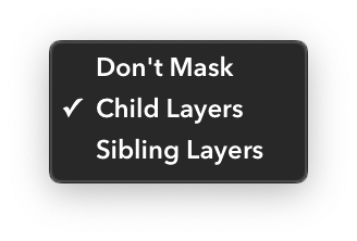
Don’t Mask
No masking is applied, all child layers and sibling layers are fully visible.
Child Layers
Child layers are masked using their parent, so that parts of child layers that lie outside of this layer are not visible.
Sibling Layers
The layer will mask its sibling layers (layers that share the same parent), so that parts of sibling layers that lie outside of this layer aren’t visible.
Rectangle


This section is only available for Rectangle layers. It allows you to change corner radius and to disable rounding of each of the 4 corners individually.
Oval
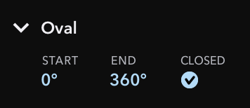

This section is only available for Oval layers. It allows you to change start angle and end angle, which makes the layer to draw only a part of an oval. You can also make oval segments opened or closed.
Opened ovals segments cannot render some placements of Stroke, due to the lack of proper “inside area”.
Polygon
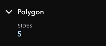

This section is only available for Polygon layers. It allows you to specify the number of sides.
Star
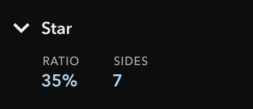

This section is only available for Star layers. It allows you to specify the number of spikes and their depth ratio. Ratio is expressed in percentage relative to layer dimensions.
Scrolling & Paging
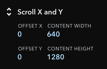
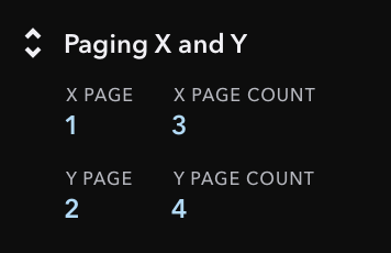
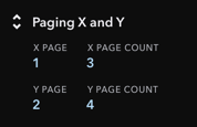
This section is only available for Scroll Layers and its content is dynamic. You can set scrolling mode by clicking on the section title, where you can pick scrolling or paging in one or both axes. Text fields of this section are available depending on the selected scroll mode:
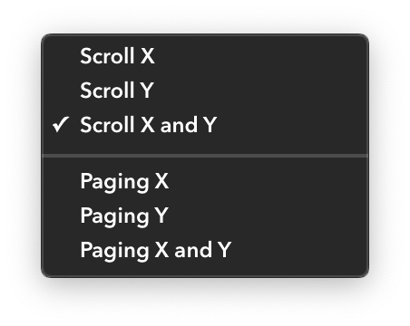
Scrolling
When Scroll Layer is in the standard scroll mode, you can set content offset and content size. In simulation, this will behave like a standard scroll view.
Paging
When Scroll Layer is in the paging mode, you can set the current page and number of pages. In simulation, this will make the layer to snap the scrolled content to page boundaries.
Symbol Layer
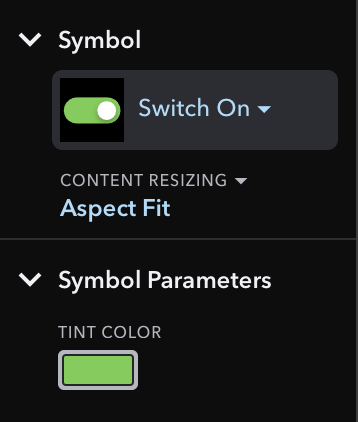

This section is only available for Symbol Layers. It allows you to change the displayed Scene and its resizing behavior. Another section is dedicated to configuring Scene Parameters, if the displayed Scene have published any.
Scene Size
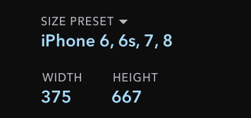

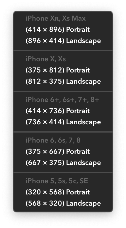
This section is only available for Scenes. It allows you to set dimensions for currently selected scenes. In addition to entering the width and height manually, you can pick one of the predefined sizes, which include common screen resolutions.
Symbol Scene
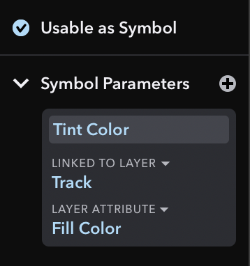
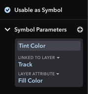
This section is only available for Scenes. It allows you to disable reusing currently selected scene as a Symbol. It also allows you to manage Scene Parameters used by those Symbols.
Timeline


This section is only available for Scenes with Animations. It allows you to preview the currently selected scene at any animation time by hovering mouse above the playback line.
To change animation time of the scene, click on the playback line or enter the time into the text field. You can also change total duration of animations by entering a new value into the duration text field.
Projection
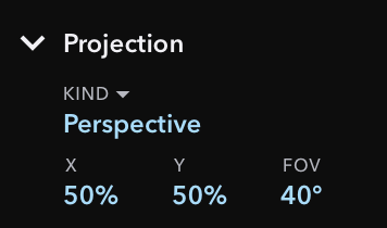

This section is only available for Scenes. It allows you to change how 3D content is rendered, either orthographically or in perspective. For perspective, you can also set vanishing point and the field of view.
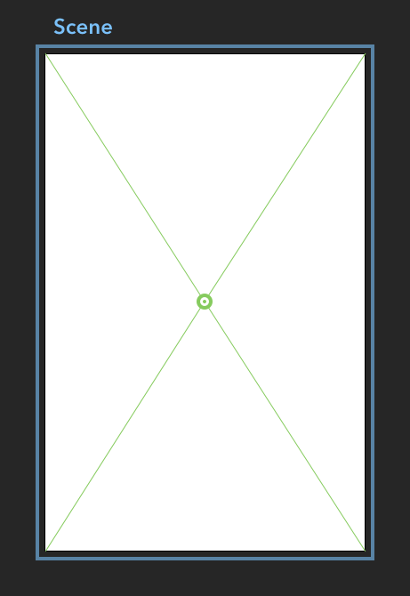
If Scene has perspective enabled and this Inspector section is opened, a green movable control is displayed in Workspace over the selected scene. You can drag this control to change the position of vanishing point for 3D content.
Text
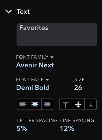
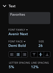
This section configures text and is only available for Text Layers. Pickers for font family and font face offer all fonts installed on your computer. You can use alignment options to place text within the layer bounds.
You can also adjust line spacing and character spacing in terms of extra space proportional to the line height or text size.
Bezier Point


This section is only available when editing Bezier Layers. It allows you to set position of selected bezier points and their curvature radius.
Resizing Constraints

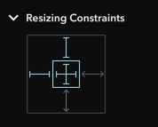
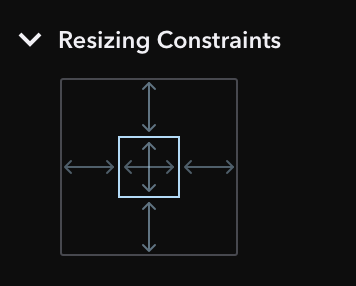
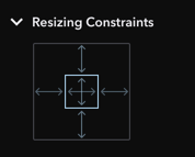
This Inspector section allows you to configure resizing behavior of selected layers, except when nested in a Group. You can toggle 6 attributes to make them rigid or flexible:
- top inset
- bottom inset
- left inset
- right inset
- width
- height
Changing these won’t move or resize selected layer in Workspace, but will affect how this selected layer behaves when its parent layer is resized.
Resizing configuration affects content of Inspector section for Position & Dimension. It also changes available attributes of the layer for Animations and Drivers.
Position & Dimension
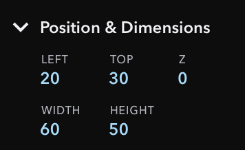
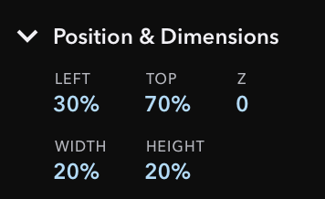
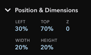
Content of this Inspector section is dynamic and it depends on resizing configuration set in Inspector section for Resizing Constraints. In default configuration, this section shows text fields for top, left, width, and height attributes, but in other configurations it may also show right and bottom attributes.
In some resizable configurations, some of these attributes may be expressed in percentage (using % suffix), when the position or dimension of the selected layer is relative to the size of its parent layer. When you change resizing configuration, the appropriate attributes are re-calculated so that the layer doesn’t change its apparent position or dimension.
Text field for Z position attribute is always present and isn’t affected by resizing configuration. Setting Z position to non-zero value makes the selected layer enter 3D space.
Rotation & Scale
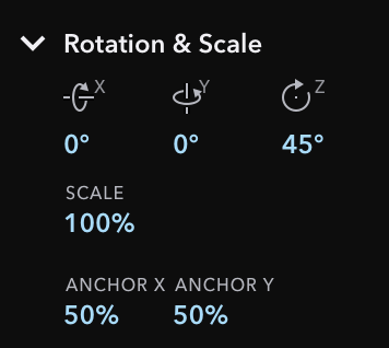
This section offers editing for rotations along all 3 major axes, uniform scaling, and position of anchor point. Most common rotation is along the Z axis, since rotating along X or Y axes makes layer enter 3D space.
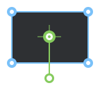
Anchor point is a point around which the layer rotates and is also used as the base for scaling. By defaut, it’s placed in top left corner (0%, 0%). Typical values are 0%, 50%, and 100%, but you can set any value, even outside of this range.
Opening this Inspector section will show a green anchor point for the selected layer in Workspace. You can change anchor by moving this green point.

Fill


This section specifies what is rendered inside of the layers’s shape. You can turn the Fill off, to make it fully transparent. Fill can be a solid color, a gradient, or an image and you can change it by clicking the sample button, which will open a popover.


Color
For a simple Color Fill, you can choose color using hue, saturation and brightness controls.
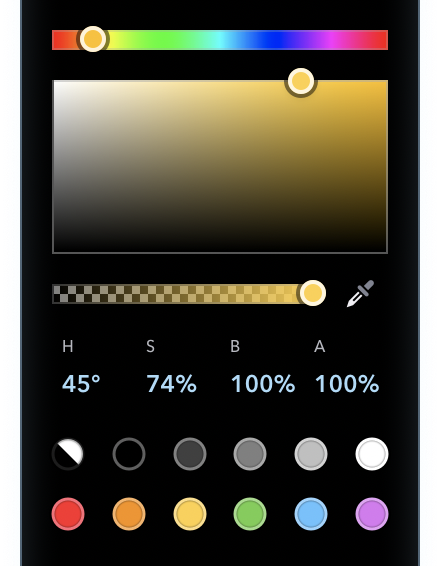

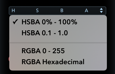
Colors can also be entered manually in various formats, including RGB components and hex strings. To change color format, click the labels above text fields.
Gradients
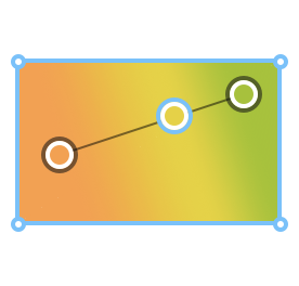
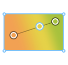
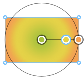
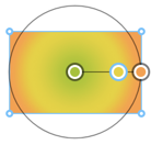
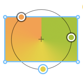
Gradient Fill allows you to specify a series of colors to be smoothly rendered in the selected layer. Gradient can be rendered as linear, radial, or angular by selecting appropriate button in the top part of the Fill popover.


Each of these gradient types has specialized controls in Workspace to set endpoints, centers, or radius. These are visible when the Fill popover is opened.

Image
Image Fill allows you to use any existing image file as a layer fill by dropping a supported image file into the popover or on the layer in the Workspace.
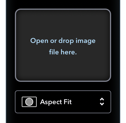
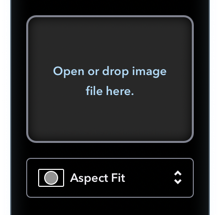
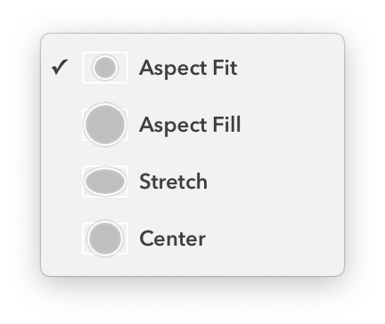
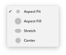
In addition, you can choose one of the 4 fitting modes for the image: aspect fit, aspect fill, stretch, and center. These affect how the image is rendered when it has different size than the layer.
Stroke
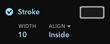

This section specifies how stroke line around the layer’s fill area is rendered. Once you turn Stroke on, you can set line width and its placement: inside, center, or outside. Stroke can be a solid color, a gradient, or an image and you can change it by clicking the sample button, which will open a popover.


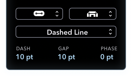
The popover also allows you to specify line caps, line join, and a stroke pattern.
Color
For a simple Color Stroke, you can choose color using hue, saturation and brightness controls.


Colors can also be entered manually in various formats, including RGB components and hex strings. To change color format, click the labels above text fields.


Gradients
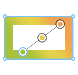
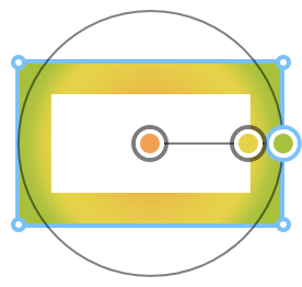
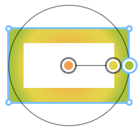
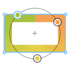
Gradient Stroke allows you to specify a series of colors to be smoothly rendered in the selected layer. Gradient can be rendered as linear, radial, or angular by selecting appropriate button in the top part of the Stroke popover.


Each of these gradient types has specialized controls in Workspace to set endpoints, centers, or radius. These are visible when the Stroke popover is opened.


Image
Image Stroke allows you to use any existing image file as a layer stroke by dropping a supported image file into the popover.


In addition, you can choose one of the 4 fitting modes for the image: aspect fit, aspect fill, stretch, and center. These affect how the image is rendered when it has different size than the layer.


Shadow


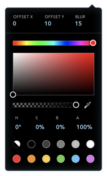
This Inspector section allows you to turn on and configure shadow of the selected layer. Shadow will be rendered beneath the non-transparent parts of the layer and all of its child layers. You can change color, offset, and blur radius of the shadow by clicking the sample button, which will open a popover.

Blur
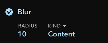

This Inspector section allows you to turn on and configure blurring of the selected layer. A layer can apply blur in two ways: on its children or on the layers beneath it. For both modes, you can set the radius of the blur in the provided text field.
Behavior


This Inspector section allows you to change and configure draggable behavior for the selected layer. When layer is configured as draggable in one or both axes, it can be dragged around in Simulator or in the Mirror App.
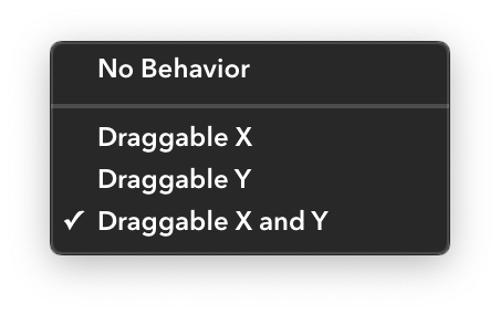
Dragging nicely pairs with Drivers, which allows you to build interactive scenes.
Not to be confused with Magic Drag, which is a special Cause of Events for trigerring Magic Move transitions.
Events
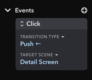

In this bottom section fo the Inspector, you will see all Events related to the currently selected Layer or Scene. You can also add or edit existing Events and Transitions right from here.
Transition
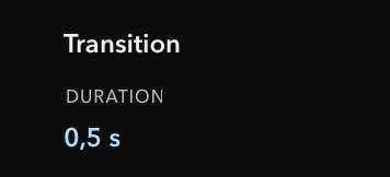

When you select a transition arrow between two Scenes in Workspace, you can change its duration, its Cause, and its type.
Timeline Selection
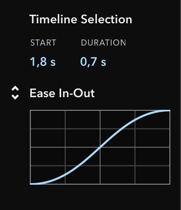
This section is only visible when editing Animations in Scene or when editing Magic Move transition. It allows you to set exact start time, duration, and Timing Function of the selected animations.